The hand has been a quintessential part of the ACT brand for years, from the painting hand to inside the logo. We've added warmth to this iconic piece of the ACT brand by making it feel more human.

Use on all ACT applications placed in the bottom left corner.
Use on an application that also has the primary signature and place in the top left corner.
Only use when the hand is too difficult to see in other applications.
When placing the primary signature, make sure there is white space around the logo equal to the height of the T.

When placing the wordmark, make sure there is white space around the word-mark equal to the height of two T’s stacked on top of each other.

When placing the small use logo, make sure there is white space around the logo equal to the height of the T.

The primary logo should not have a height smaller than 0.5 of an inch.

The small-use logo should be between 0.5 inches and 0.125 inches. Do not use scalable logo in places where the primary logo can be used.

The wordmark should not be smaller than 0.125 of an inch.

On a white background, use either the green or black version of the ACT logo.
On a full color background, use the white version of either the primary logo, wordmark or small-use logo.


HEADING ONE (DOMINE)
SUBHEADING (AVENIR BOLD)
SMALL LEVEL HEADING (AVENIR BOLD ALL CAPS)
When a patient's commitment to recovery is paired with healing through art, anything is possible.
BODY TEXT (AVENIR ROMAN)
PMS: Black 6 U
HEX: #000000
CMYK: 0, 0, 0, 100
PMS: 179-1 U
Hex: #F5F5F1
CMYK: 3, 2, 4, 0
Use reimagined lines from the ACT Creative Cube to highlight specific elements.
When visualizing various ACT programs, use these icons, which utilize lines from the Creative Cube.
Use these Creative Cube patterns to create visual consistency between the ACT Open Studios and Creative Cube.


Using the type system, imagery, and color palette, we have created a system for the way brands of ACT should look. This includes studios, events, and internal groups.
ACT features Open Studios at their studio as well as the Creative Cube, a mobile art studio. Keeping these similar in style connects the two and creates a consistent aesthetic for these events.


The yearly theme will drive the branding for the annual Auction, Art Exhibition, and Festival. The name of the theme should not be repeated, but similar names should be used.
Ex.We Are All Radiant Auction, Shine On Festival, and Shine Bright Exhibition


Groups such as the ACTion Drummers, ACTion Choir, and Creative Leaders Committee use the primary color palette on a white background with associated icons.


All imagery should be used in a 1:1 or 3:4 / 4:3 aspect ratio.

Portraits should frame the individual in the center of the shot holding an art piece they’re working on, an instrument they’re learning, etc. Let them get creative and add their own flair!
* If on an iPhone, shoot in Portrait Mode whenever possible.
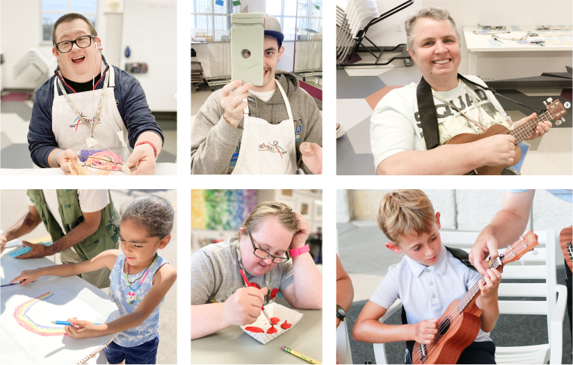
Group photos should include two or more individuals centered in the shot, at work in the studio or on a field trip. Photos can be posed or candid.

Photograph artwork in natural light with straight-on or overhead perspective. Work to eliminate perspective distortion and shadows.
* Whenever possible, scan in art features using a scanner or digital printer.

Portrait and group photos should be bright with a slight warmth. In contrast, art features should remain bright but as neutral as possible to highlight the original colors used in the piece.
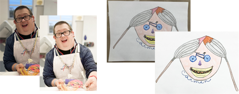
Polaroids are an essential part of the ACT brand. Easily replace the image with a Canva template:
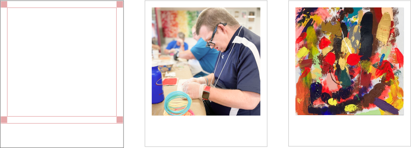
Framing images with a white border can be done easily with a Canva template:
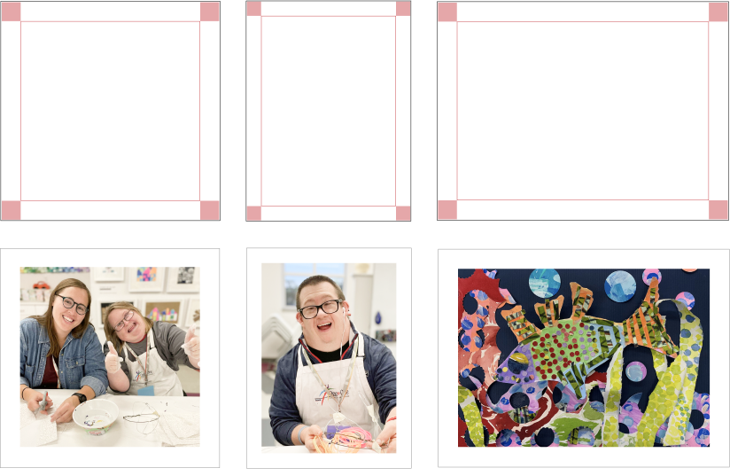
Editing photos in Canva is easy! Just brighten the exposure and alter the temperature to achieve the desired look.


Grids are important for consistency across all applications. The use of a grid will make a gallery layout easier and ensure that there is enough room around the logo and content.
When you're creating a design, make columns and rows that form near-perfect squares in-between. All margins should be 8% of the width, and all gutters should be 2% of the width. Refer to the diagram below, where the green area represents the margin and the blue area represents the gutters.
